

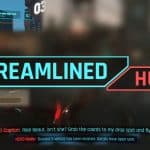
Streamlined HUD
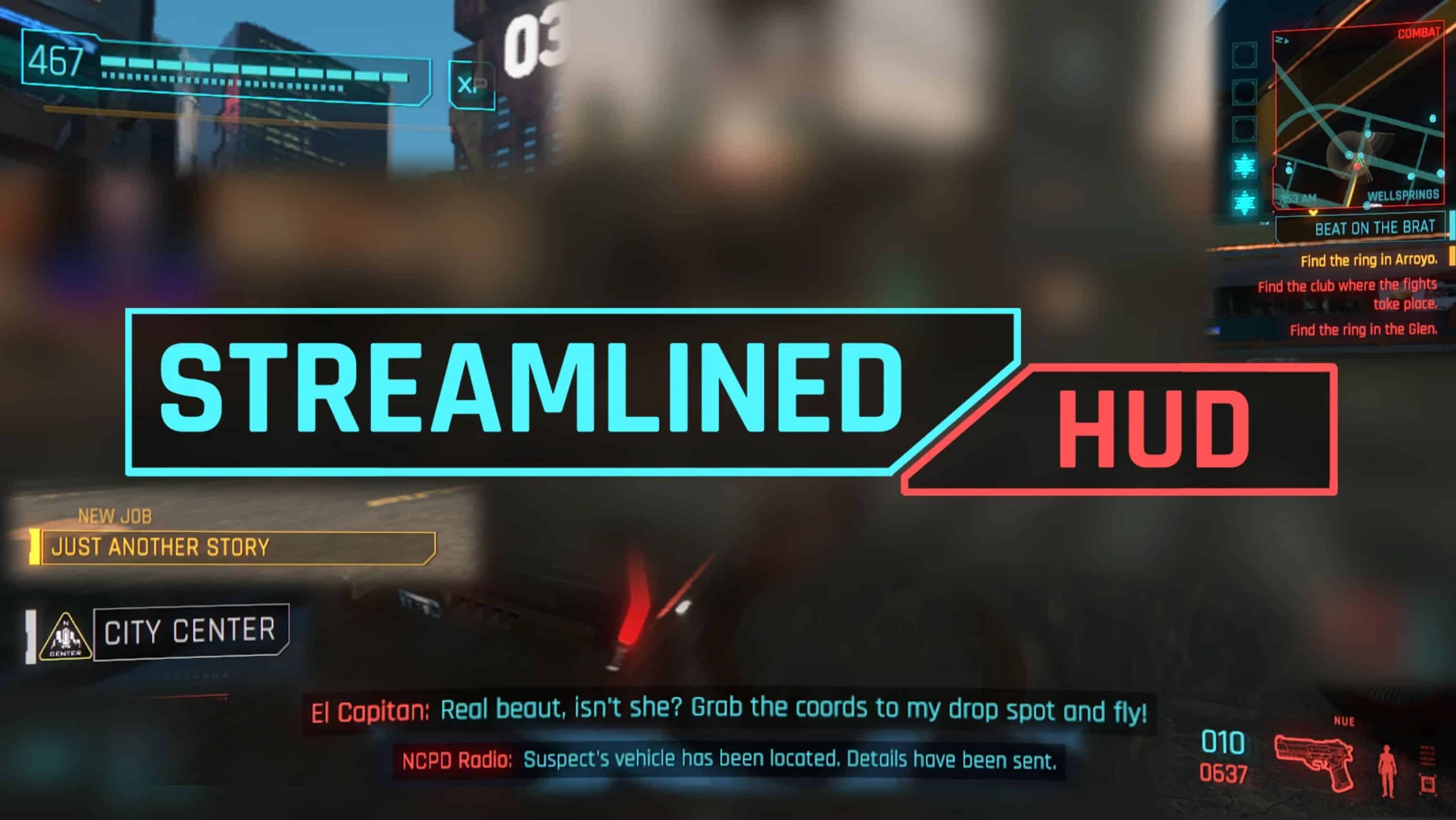
My own take on the game’s user interface, or… Deus Ex HUD 2077 edition i think?
I always find it jarring how the HUD design on the vanilla game is all over the place, the health bar, the quest widget, the notifications, the ammo counter, everything looks different from each other, except the DPAD hint, Minimap, Phone caller widget, and the rest of fullscreen HUD, even the 2018/2019 version of the game’s HUD is better than the final version (but there’s mods that does that already) so i bring you…
Streamlined HUD
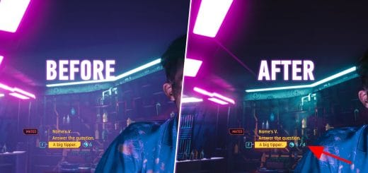
What it does is simply makes everything connected / similiar, while respecting the overall UI design.
Feedbacks would be appreaciated, please do tell if you have good or better idea than mine.
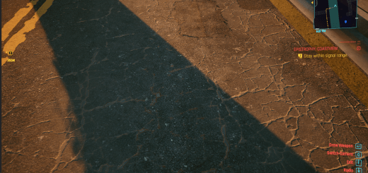
Also removed the red background on Contact / SMS manager, Vehicle call, and Weapon wheel, and some additional changes.
Compatibility:
– HUDitor ✔
– Limited HUD ✔
– Spicy’s HUD colors ✔
– TheManualEnhancer’s HUD colors ✔
– Bloat Begone ✔
– Preem Scanner ✔ (Add “#” or “0_” to overwrite this mod)
– Purify the UI ✔ (Add “#” or “0_” to overwrite this mod)
Known issues:
Hopefully none
To do:
– Phone call widget
– Message notifications widget
– Should i make the inventory background black/grey? so it doesn’t look weird when used with hud colors mods, because for some reason it’s a red texture instead of canvas like in settings / pause menu
Installation: “\Cyberpunk 2077\archive\pc\mod”

